Cinematography technique · used in 6 films

Desaturated War Palette

Draining most of the color from the image, leaving gray skies, cold blues and muted browns. The world looks stripped of comfort and hope, and you can't enjoy it as pretty.

Examples

6 films that use it

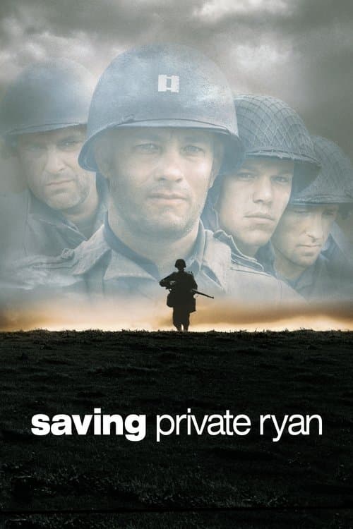
  1. Saving Private Ryan (1998) poster

    Saving Private Ryan

    Steven Spielberg · 1998

    Janusz Kamiński removed the protective coatings from the lenses and underexposed the film to get a bleached look like old newsreels. The images are not beautiful. Spielberg and Kamiński made a deliberate choice that war should not look good.

    Where to see it: The entire Omaha Beach sequence. The color is as drained as it can get while you can still read the image.

  2. The Hurt Locker (2008) poster

    The Hurt Locker

    Kathryn Bigelow · 2008

    The Iraq streets are shown in tired beiges, grays and dust. The washed-out colors make the place feel hostile and blank. Neither your eye nor the soldier gets anywhere to rest.

    Where to see it: The wide shots of the Baghdad streets. The color palette makes the entire city look like a threat.

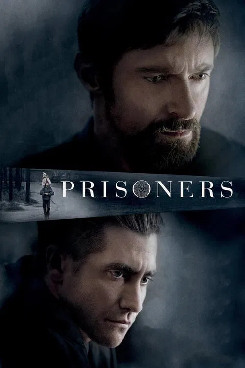
  3. Prisoners (2013) poster

    Prisoners

    Denis Villeneuve · 2013

    Roger Deakins photographs the film's Pennsylvania suburb in constant gray. The sky is always overcast, the trees are bare and the interiors are lit with flat, cold light. The palette makes the community's normal life feel fragile. It's the color of a world that has had something essential taken away and hasn't gotten it back yet.

    Where to see it: The Thanksgiving Day disappearance. The bare trees, the gray sky and the muted tones show a world that has lost its warmth before the actual loss happens.

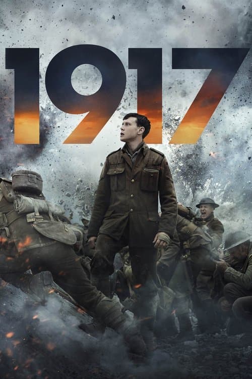
  4. 1917 (2019) poster

    1917

    Sam Mendes · 2019

    Deakins drains the Western Front of color (the mudscape, the ruined villages, the grey-white sky). He saves warm light for the rare moments when people connect. That is, the contrast is what makes those moments precious.

    Where to see it: The cellar in the ruined French town. A single candle and a crying infant give the film its only lasting warmth.

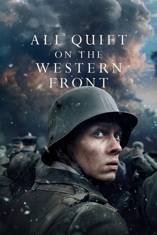
  5. All Quiet on the Western Front (2022) poster

    All Quiet on the Western Front

    Edward Berger · 2022

    James Friend's cinematography drains the color out of the Western Front with clinical thoroughness. The mud is gray-brown, the sky is gray-white and the faces are gray. This is the first thing the film tells you: in this world, heroism doesn't look good on camera. Color only comes back in brief flashes of beauty, and the war immediately puts them out.

    Where to see it: The trench sequences. There is so little color that the film stops feeling like a dramatic reconstruction. It feels like a record of bodies being worn down.

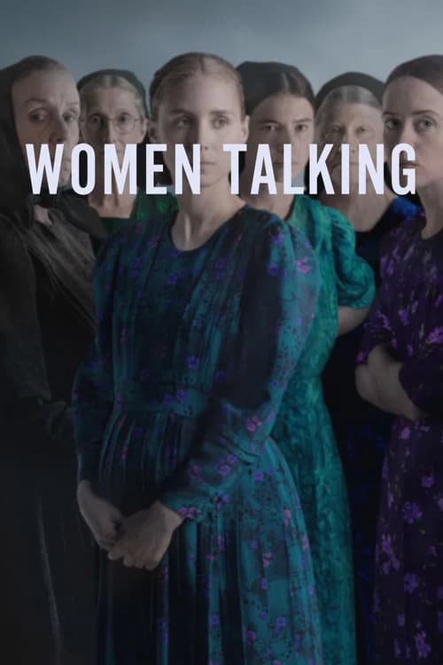
  6. Women Talking (2022) poster

    Women Talking

    Sarah Polley · 2022

    Luc Montpellier's photography is almost black and white. The color is barely there, a grey-gold in filtered light. It makes the film look like a historical record, so the women's debate feels both specific and archival.

    Where to see it: The hayloft filled with dusty light. The washed-out palette makes the present-day story feel like testimony from a past that has not ended yet.

Questions

Quick answers

What is desaturated war palette in film?
Draining most of the color from the image, leaving gray skies, cold blues and muted browns. The world looks stripped of comfort and hope, and you can't enjoy it as pretty.
Which films use desaturated war palette?
Saving Private Ryan (1998), The Hurt Locker (2008), Prisoners (2013), 1917 (2019), All Quiet on the Western Front (2022), Women Talking (2022).
What kind of technique is desaturated war palette?
It is a cinematography technique. Related cinematography techniques include Shutter Angle Manipulation, Handheld Cinema Vérité, Heat as Psychological Pressure.