Desaturation as the look of war
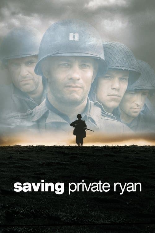
Saving Private Ryan (1998) is the film most people think of first. Janusz Kaminski took the protective coating off the lenses and the lab processed the film so the colors came out muted. The Omaha Beach landing looks pale and grainy, close to the newsreel footage audiences already knew.
The modern-day scenes at the start and end, in the cemetery in Normandy, are in full color. That difference separates the old soldier's present from his memory, and it makes the grey of the war feel like something that has been drained out of the men.
The grey of a state that watches
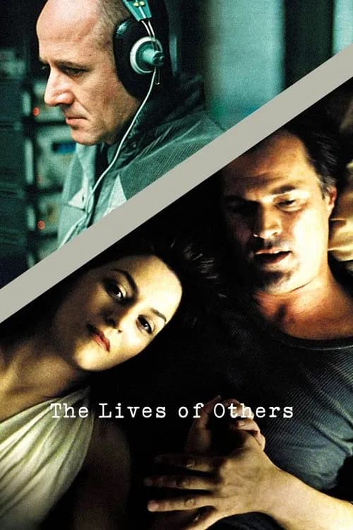
The Lives of Others (2006) is set in East Berlin in 1984. The look leans on cold greys, greens and a few dull browns. Wiesler's Stasi world is a place of corridors, office desks and small flats where almost nothing bright is allowed in.
The contrast helps the story. The playwright Dreyman's apartment has more color and warmth, with books and a bit of red, and Wiesler listens to it from an attic. Watching a man in a grey world get pulled toward a warmer one is the film's whole arc, and the color grade says it before the dialogue does.
Cold light for a missing child
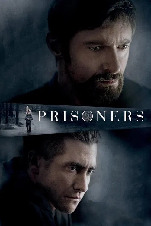
Prisoners (2013) takes place in a Pennsylvania town in late fall. Roger Deakins shoots it under overcast skies and rain, with bare trees and wet roads that hold very little color. Inside the houses, the light turns amber, which keeps the interiors dim and a little close.
The low color makes the film feel like a long wait. Keller Dover's anger grows in a world that has nothing bright to push back against it. When the story moves into the basements and the dark rooms, the palette barely changes, and you notice how little escape there has been.
A colony that looks like a memory
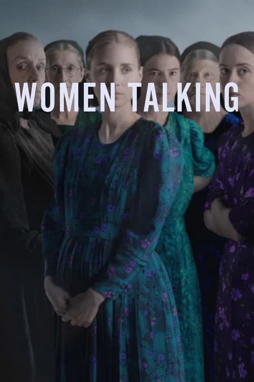
Women Talking (2022) is set in an isolated Mennonite colony, and Sarah Polley and cinematographer Luc Montpellier chose a washed-out palette that feels more like a remembered past than a specific year. Most of the film is a group of women debating in a hayloft, and the greys and faded earth tones keep the room heavy.
Outdoors, a little color is allowed back in, in the fields and with the children. Montpellier has said they wanted some light and color to seep through in moments that show the beauty of the place, and reviewers noted that more of it appears near the end. The film uses the muted look to show what these women have lost, and the returning color to show what they might still hope for.
Two worlds, two palettes
Pan's Labyrinth (2006) splits its look in two. The real world of 1944 Spain, with the army camp and the rebel hideout, is shot in cold blues and greys. Captain Vidal's mill is full of steel and dark wood. Ofelia's fantasy world pulls in warm amber, gold and deep red.
The color tells you where the girl wants to be. The warm world is dangerous, as the Pale Man's red-tinted banquet room shows, but it still feels more alive than the grey one. In the last scene in the underground throne room, the palette is warm gold, which gives her ending a feeling of being somewhere else.

Color that leaves as a person falls apart
Requiem for a Dream (2000) tracks four people from summer through fall and winter. In the summer section, the colors are warm and the images are bright. Harry, Marion and Tyrone are hopeful, and the sun-lit Coney Island sections feel almost like postcards.
As the addictions deepen, the grade turns colder and flatter. By winter, the palette is blue and grey, and faces look pale. The film tracks each character's decline through the season, so the loss of color works like a countdown.

One red coat, and color at the end
Schindler's List (1993) is shot in black and white, which is the extreme end of desaturation. Spielberg uses it to look like documentary footage and to keep the Holocaust away from the glossy look of a Hollywood period piece. The one exception in the main story is a little girl in a red coat, seen during the liquidation of the Krakow ghetto.
Oskar Schindler sees her, and later the coat shows up again on a cart of bodies. Color returns once more at the very end, when the survivors and the actors who played them walk to Schindler's grave in full color. After 3 hours of grey, the change reads as a payoff, and it makes the story feel like it belongs to real people.

How to use this when you watch
The next time a film or show looks washed out, ask what the filmmakers took away and what they let through. Then watch for the first moment color comes back, because that is usually where the story wants you to feel hope, memory or loss. Pause on that frame and look at what is in it.
More guides
- Film Noir Lighting Explained: 8 Films That Nail It
- How Directors Build Suspense: 8 Films That Show You How
- Unreliable Narrator Movies Explained: 9 Films That Fool You
- Non-Linear Movies Explained: 8 Films Told Out of Order
- Long Takes and Oners Explained: 9 Famous One-Shot Scenes
- How Color Tells the Story: 9 Films With Meaningful Palettes