Cinematography technique · used in 33 films

Color Palette as Worldbuilding

Limiting the film to a tightly chosen set of colors, or giving each place or state its own set. The colors tell you about the world and its mood without dialogue.

Examples

33 films that use it

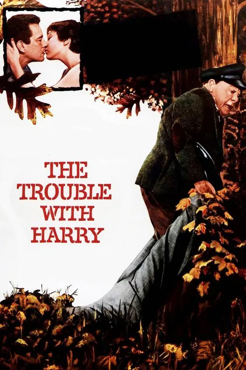
  1. The Trouble with Harry (1955) poster

    The Trouble with Harry

    Alfred Hitchcock · 1955

    The film is set among autumn leaves in Vermont. The crew arrived to find the trees nearly bare, so they glued leaves back on. The painter John Ferren made the paintings Sam sells, and Hitchcock liked how his vivid colors matched the foliage.

    Where to see it: The autumn hillside. Real Vermont locations, with leaves glued to the trees, set the warm look of the burial scenes.
  2. Le Samourai (1967) poster

    Le Samourai

    Jean-Pierre Melville · 1967

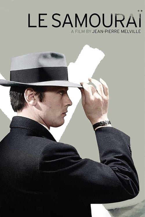
    Henri Decaë films Paris in drained grey-blues that don't match the city's real color. The palette comes entirely from Jef's state of mind. The world is grey because it holds no emotional value for a man who has cut feeling out of his life. That is, the colors are a portrait of what goes on inside him.

    Where to see it: Jef's apartment and the grey Paris streets. The drained colors set up a world defined by what the job requires. There is pretty much no lived experience in it.

  3. Army of Shadows (1969) poster

    Army of Shadows

    Jean-Pierre Melville · 1969

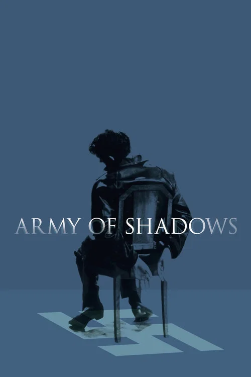
    The film is washed in cold blues and grays. The colors tell you the world is bleak and the mood is grim before anyone speaks.

    Where to see it: The streets: the occupied city looks gray and empty, with muted blue light in the rooms and cars.

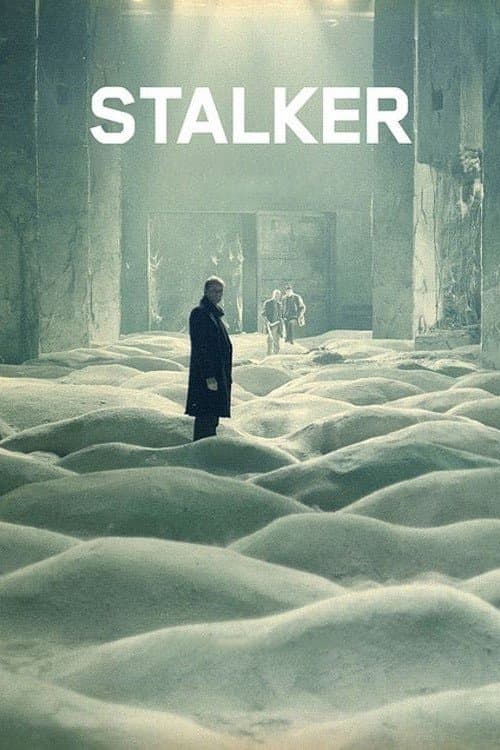
  4. Stalker (1979) poster

    Stalker

    Andrei Tarkovsky · 1979

    The world outside the Zone is shown in washed-out sepia, a brownish tint. It looks industrial, grey and exhausted. Inside the Zone, the footage is in full color. That shift in color is the film's argument. That is, the Zone is more real, more alive and more human than the world around it.

    Where to see it: The crossing into the Zone. The sepia world is left behind. The first lush color images of the Zone's abandoned landscape appear like a hallucination.

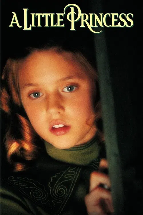
  5. A Little Princess (1995) poster

    A Little Princess

    Alfonso Cuarón · 1995

    Cuarón and cinematographer Emmanuel Lubezki soak the film in green. It's in the school, the clothes and the light. Cuarón once said green is the only color he understands, and here it makes 1914 New York feel like a storybook.

    Where to see it: Sara's birthday party. The school is dressed up in rich greens for her, right before the lawyer arrives with the news about her father.

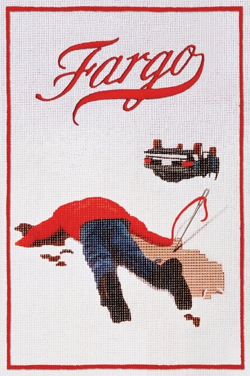
  6. Fargo (1996) poster

    Fargo

    Joel Coen, Ethan Coen · 1996

    Roger Deakins photographs the Minnesota winter as an unbroken field of white. Roads, fields and sky all merge into the same colorless stretch. People stand exposed against that blankness with nowhere to hide. They are cut off physically, and they are cut off morally too.

    Where to see it: The wide shots of the kidnap car on the empty highway. Figures move through a white world with no cover. In that landscape, what they have done has nowhere to hide either.

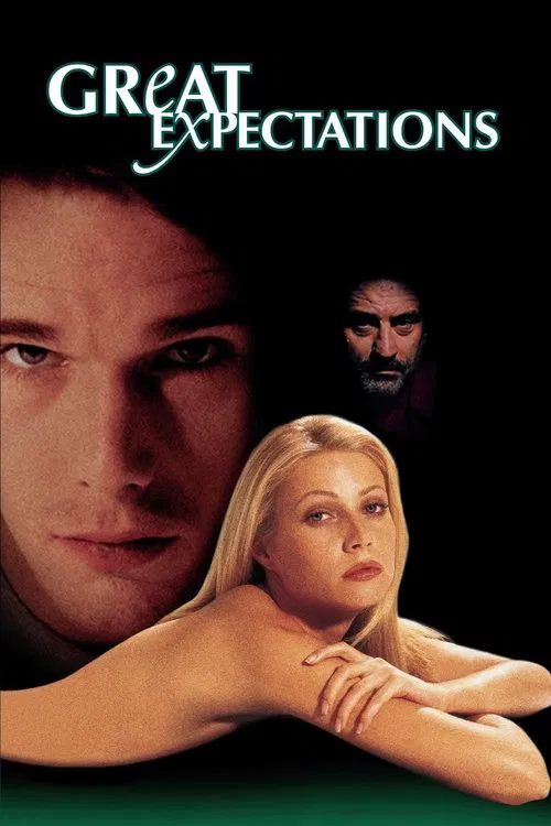
  7. Great Expectations (1998) poster

    Great Expectations

    Alfonso Cuarón · 1998

    Cuarón and Emmanuel Lubezki use green as the main color. It shows up in the Gulf Coast water, the overgrown mansion and even Estella's clothes. The color holds Finn's whole world together, from childhood to New York.

    Where to see it: Finn's first visit to Paradiso Perduto. Young Finn walks through the overgrown green grounds of the mansion and meets Estella for the first time.

  8. In the Mood for Love (2000) poster

    In the Mood for Love

    Wong Kar-wai · 2000

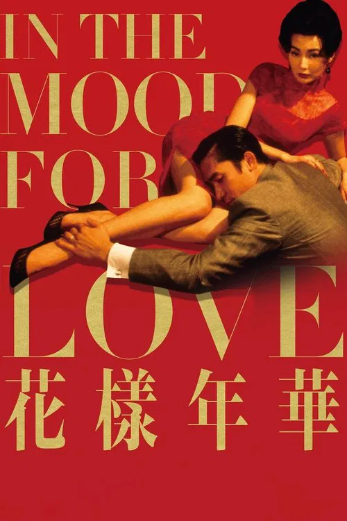
    Wong Kar-wai and his cinematographers Christopher Doyle and Mark Lee Ping-bing fill the cramped Hong Kong apartments with deep reds, amber and gold. Those colors make desire feel like something you could touch. They are emotionally exact, even though they are not accurate to the period. The world is soaked in the feeling the characters can't express.

    Where to see it: Mrs. Chan's cheongsam dresses against the red wallpaper of the corridor. The colors let you see the desire the 2 of them hold back, since nobody acts on it.

  9. Amélie (2001) poster

    Amélie

    Jean-Pierre Jeunet · 2001

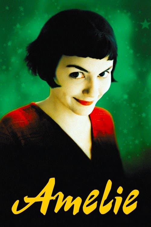
    Bruno Delbonnel's cinematography shows Paris in boosted greens and warm reds. Those are the colors of Amélie's inner world, and the real city doesn't look like that. The palette tells you right away that this world exists inside her perception, where her imagination has made everything slightly better.

    Where to see it: The opening montage of Amélie's likes and dislikes. The green and red palette sets up the film's world, seen her way, before the story begins.

  10. Road to Perdition (2002) poster

    Road to Perdition

    Sam Mendes · 2002

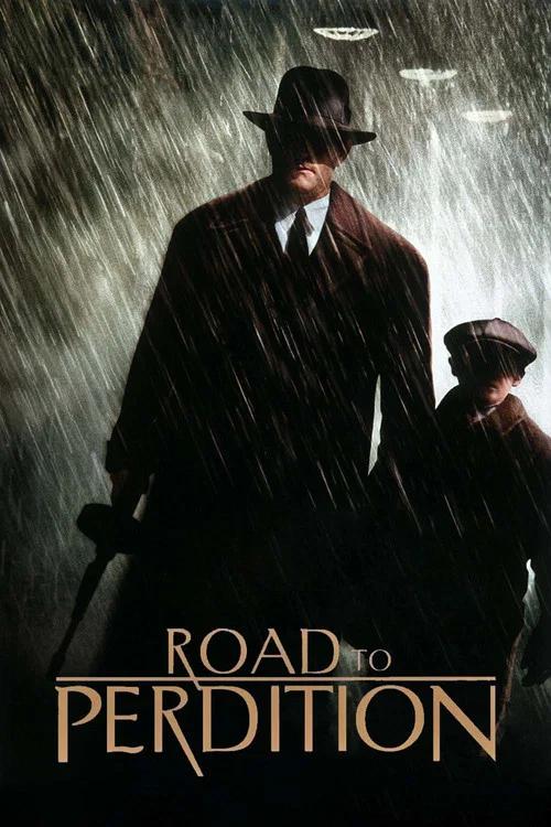
    Mendes sought a muted palette for the film, and he shot exteriors in real winter and spring weather, including snow, rain and mud. The grays and browns make the Depression-era Midwest feel cold and bleak. The colors suit the idea that none of these men will be saved.

    Where to see it: The winter road scenes: Sullivan and Michael travel through the Midwest in the cold on their way to Perdition.

  11. Lost in Translation (2003) poster

    Lost in Translation

    Sofia Coppola · 2003

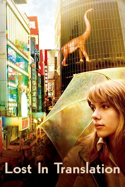
    Coppola and cinematographer Lance Acord film Tokyo in neon, fluorescent tubes and late-night artificial light. Those colors make the city beautiful and deeply disorienting at the same time. They don't make Tokyo look hostile or exotic. They show a world that makes sense on its own terms but feels foreign, like the feelings the film is about.

    Where to see it: The nighttime Tokyo sequences. The neon city looks gorgeous and lonely at once. The colors carry the film's main feeling, which is being lost somewhere beautiful.

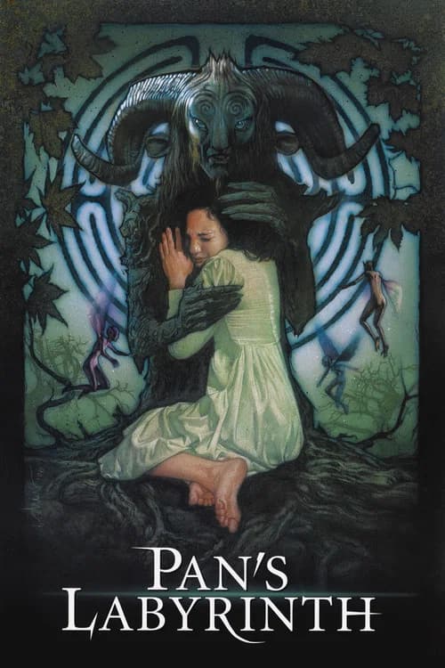
  12. Pan's Labyrinth (2006) poster

    Pan's Labyrinth

    Guillermo del Toro · 2006

    Del Toro and cinematographer Guillermo Navarro use warm amber and gold for the fantasy sequences and cold blue-gray for the real world. The color tells you where the film's sympathies are. The fantasy world is dangerous and still feels warm. The real world is orderly and still feels cold. When Ofelia chooses between them, she is also choosing between warm and cold color.

    Where to see it: The cut between the cold blue of the military outpost and the warm gold of the labyrinth's entrance. The color shift tells you which world you have entered.

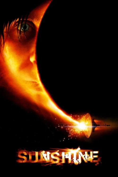
  13. Sunshine (2007) poster

    Sunshine

    Danny Boyle · 2007

    Cinematographer Alwin Kuchler gave the ship's interior grays, blues and greens with no orange, red or yellow. Because audiences are starved of those colors, sunlight feels like it penetrates the screen when it finally appears.

    Where to see it: Kaneda's sacrifice: Kaneda completes the final shield repair himself, moments before a wave of sunlight engulfs and kills him.

  14. Speed Racer (2008) poster

    Speed Racer

    Lana Wachowski, Lilly Wachowski · 2008

    The film runs on loud, saturated color. Cinematographer David Tattersall picked a digital camera partly for a Techno Color look. The candy-bright world tells you before anyone speaks that this is a cartoon with real feelings in it.

    Where to see it: The Casa Cristo 5000 rally. Speed joins a deadly cross-country race with Racer X to get evidence against Royalton.

  15. Fantastic Mr. Fox (2009) poster

    Fantastic Mr. Fox

    Wes Anderson · 2009

    The film's autumn colors are amber, brown, rust and gold, and they make the English countryside one consistent world. The colors are warm enough to be inviting. They are also specific enough that it feels like a real landscape, which is fairly rare for an animated one.

    Where to see it: The overhead shots of the Fox family running through the autumn countryside. The colors turn the English landscape into a storybook illustration, and it still feels like a real place.

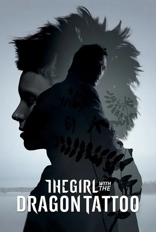
  16. The Girl with the Dragon Tattoo (2011) poster

    The Girl with the Dragon Tattoo

    David Fincher · 2011

    Cinematographer Jeff Cronenweth shot with RED MX digital cameras and aimed for a realistic look with cold, low winter light. Sweden feels pale, grey and tough, and the family's island estate looks as closed off as the secrets inside it.

    Where to see it: The Vanger estate. Blomkvist works on the family's island estate while he looks for what happened to Harriet.

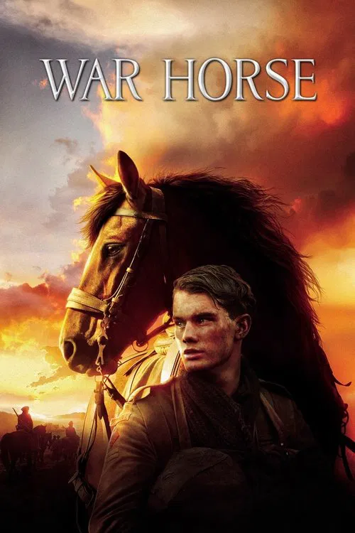
  17. War Horse (2011) poster

    War Horse

    Steven Spielberg · 2011

    The Devon farm glows with warm gold light and big skies, and the war scenes turn cold and gray. The change in color tells you what the horse has lost. You feel the distance from home before anyone says it.

    Where to see it: The Devon fields: Albert and Joey plow a rocky field in warm light, and the later war scenes use colder colors.

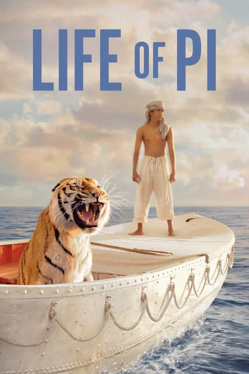
  18. Life of Pi (2012) poster

    Life of Pi

    Ang Lee · 2012

    Claudio Miranda shoots ocean sequences full of bioluminescence, which is light made by living creatures. At night, the Pacific turns into a mirror, lit from below by glowing animals. The survival story ends up looking like something between a documentary and a myth. The ocean feels alive, with a light of its own.

    Where to see it: The bioluminescent whale surfacing at night. The Pacific becomes a mirror of light. The tiger and the boy witness something that no survival documentary has ever photographed.

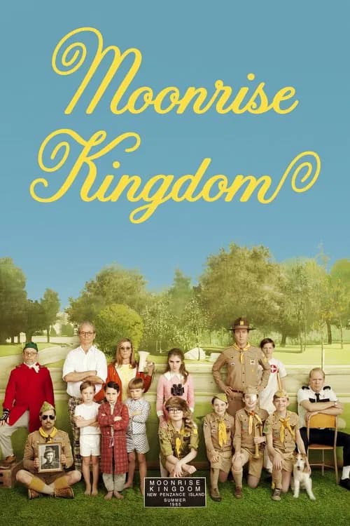
  19. Moonrise Kingdom (2012) poster

    Moonrise Kingdom

    Wes Anderson · 2012

    Robert Yeoman's photography uses warm amber, khaki and autumn orange throughout. The colors make 1965 New England look like a world preserved in amber. The warmth suggests that this particular summer exists outside ordinary time.

    Where to see it: Sam and Suzy's first camp. The colors of their makeshift world are warm and specific. They make the home the children invent feel more vivid than the adult world chasing them.

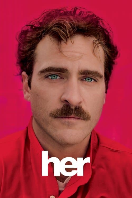
  20. Her (2013) poster

    Her

    Spike Jonze · 2013

    Hoyte van Hoytema's cinematography bathes the whole film in warm reds, oranges and creams. The rich colors make the world feel comforting and artificially cheerful at the same time, which matches Theodore's emotional numbness.

    Where to see it: Theodore walking through the city. Every frame is filled with warm amber light.

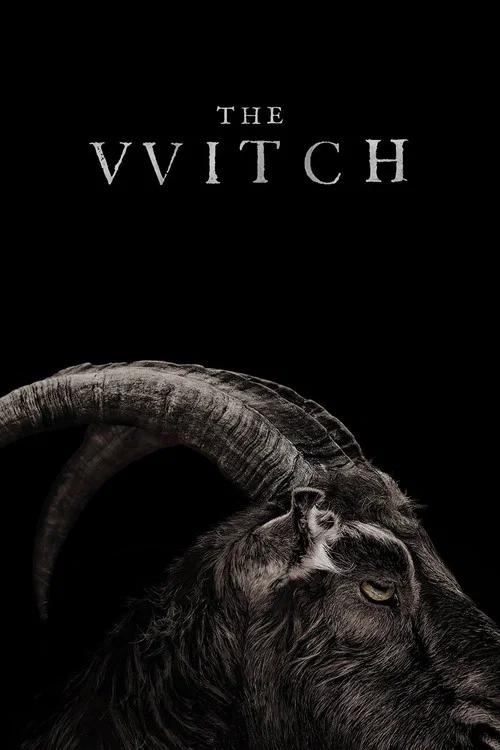
  21. The Witch (2015) poster

    The Witch

    Robert Eggers · 2015

    Jarin Blaschke shoots the film in grey-silver winter light that comes entirely from the overcast sky and candles. The colors make the Puritan worldview something you can see: a world where beauty is physically out of reach.

    Where to see it: The exterior field scenes. The grey sky presses down on the family like a heavy religious ceiling.
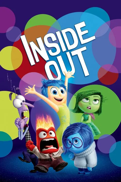
  22. Inside Out (2015) poster

    Inside Out

    Pete Docter · 2015

    The inside of Riley's head uses soft shapes, glowing light and saturated color. The real world is drawn with the opposite look, so you always know which place you are in. Each emotion also gets its own color, which keeps a crowded control room readable.

    Where to see it: Headquarters at work. Five colored characters stand at a console and react to Riley's day, and each memory orb takes the color of the emotion that made it.

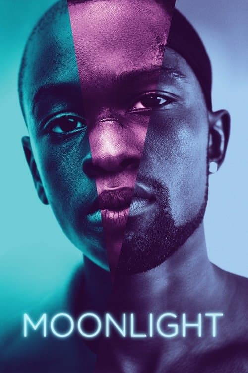
  23. Moonlight (2016) poster

    Moonlight

    Barry Jenkins · 2016

    James Laxton's cinematography fills Miami's Liberty City with blue, gold and warm amber. Those are the colors of skin under artificial light, of the ocean at night and of a world that is beautiful and dangerous at the same time. The colors go for feeling and make no attempt at realism. That is, the film looks the way the place feels to the characters, which is different from how a documentary camera would record it.

    Where to see it: The ocean teaching scene. Juan holds Little in the water. The deep blue of the ocean makes the moment feel both safe and enormous.

  24. The BFG (2016) poster

    The BFG

    Steven Spielberg · 2016

    The dream scenes glow in soft blues and purples, while the bullies' land is rough and brown. The colors tell you where the story is gentle and where it is hostile.

    Where to see it: The dream jars: The BFG shows Sophie glowing jars of dreams, each with its own light.

  25. Blade Runner 2049 (2017) poster

    Blade Runner 2049

    Denis Villeneuve · 2017

    Roger Deakins gives each zone of 2049 its own colors. Los Angeles is a mix of cyans, teals and desaturated greens, the ruins of Las Vegas glow orange and red and Wallace's compound is lit in amber and gold. This color system is the film's map. You always know where you are and what that place means.

    Where to see it: K's arrival in the ruins of Las Vegas. The film moves from rain-grey Los Angeles to an orange and red wasteland. The change in color tells you the moral tone has changed too.

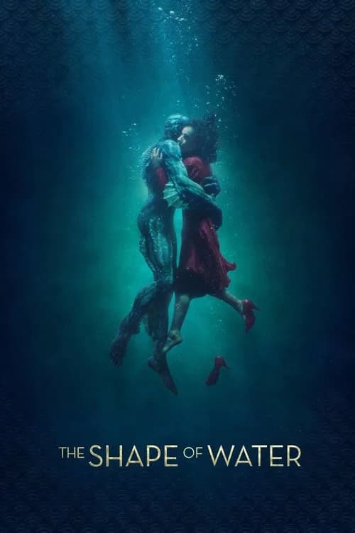
  26. The Shape of Water (2017) poster

    The Shape of Water

    Guillermo del Toro · 2017

    Dan Laustsen fills the film with green, steel blue and teal. These are the colors of water and of the creature, and Elisa's apartment is green and teal too. The light turns golden when the characters feel love. The colors work like a moral map. Places with drained color belong to institutional power, and places that glow are where real feeling lives.

    Where to see it: Elisa's apartment. Its green and teal tones make it the emotional center of the film before any plot has started.

  27. Star Wars: The Last Jedi (2017) poster

    Star Wars: The Last Jedi

    Rian Johnson · 2017

    The planet Crait is a white salt flat with red earth under the crust. When the speeders race across it, red trails kick up against the white. The two colors turn a battle into something stark and easy to read.

    Where to see it: The battle of Crait. The Resistance defends a fortress on the salt flat, and the white crust breaks open to show red underneath.

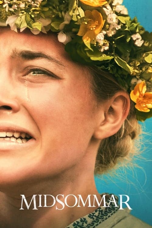
  28. Midsommar (2019) poster

    Midsommar

    Ari Aster · 2019

    Pawel Pogorzelski films the Swedish commune in constant, saturated daylight. The yellows, whites and greens turn away from the darkness you expect in horror. The color choice makes the film's case. Horror doesn't need shadows when a community's logic is fully on show in the light.

    Where to see it: The arrival at Hårga. The film moves into permanent daylight. The colors tell you that the usual rules of horror won't apply here.

  29. Soul (2020) poster

    Soul

    Pete Docter · 2020

    The Great Before uses cool blues, purples and whites against an endless void. The colors feel calm, abstract and slightly sad. New York blazes with warm amber and gold, and it has the crowded mess of life being lived.

    Where to see it: Joe's soul arriving in the Great Before. The color shifts from the warm street to the cool, abstract pre-life world. You immediately get what is at stake in getting back.

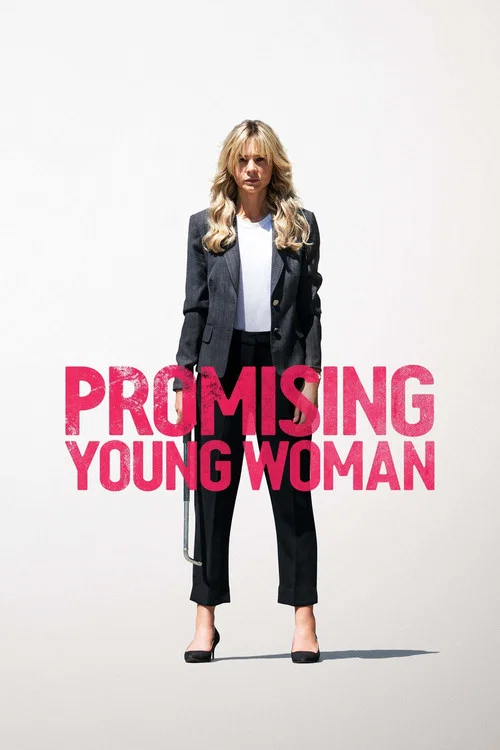
  30. Promising Young Woman (2020) poster

    Promising Young Woman

    Emerald Fennell · 2020

    The film is full of candy colors, pinks and baby blues in the coffee shop, the clothes and the nails. The cheerful palette makes the story look harmless, and it makes the dark scenes hurt more.

    Where to see it: The coffee shop: Cassie works behind a counter in a sugary pink and blue room, then walks into a darker bar at night.

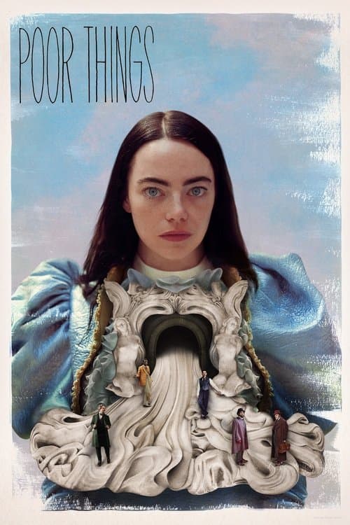
  31. Poor Things (2023) poster

    Poor Things

    Yorgos Lanthimos · 2023

    Robbie Ryan's cinematography moves the film through distinct color stages as Bella's mind develops. The washed-out black-and-white of the opening gives way to full color as she grows. The colors chart Bella's inner life, so the world gets more vivid the more deeply she engages with it.

    Where to see it: The transition from monochrome to color. The look of the film follows Bella's growing mind, and the world literally brightens as she becomes more herself.

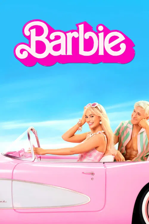
  32. Barbie (2023) poster

    Barbie

    Greta Gerwig · 2023

    Barbieland is built in bright toy pink, from the houses to the cars. The sets needed the paint supplier's whole remaining stock of one shade of pink. When Barbie and Ken reach Los Angeles, the pink is gone, and the real world looks plain next to them.

    Where to see it: The first morning in Barbieland. Barbies wave to each other from open pink houses, and the sky behind them is a painted backdrop.

  33. Asteroid City (2023) poster

    Asteroid City

    Wes Anderson · 2023

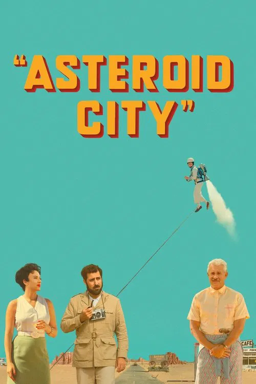
    The play uses stylized color and the documentary uses black and white, so each layer has its own palette. The desert town looks like a postcard of 1955, and the color tells you you are inside the play.

    Where to see it: The Junior Stargazer convention: War photojournalist Augie Steenbeck and actress Midge Campbell meet at the convention.

Questions

Quick answers

What is color palette as worldbuilding in film?
Limiting the film to a tightly chosen set of colors, or giving each place or state its own set. The colors tell you about the world and its mood without dialogue.
Which films use color palette as worldbuilding?
The Trouble with Harry (1955), Le Samourai (1967), Army of Shadows (1969), Stalker (1979), A Little Princess (1995), Fargo (1996) and 27 more films in the CineCode library.
What kind of technique is color palette as worldbuilding?
It is a cinematography technique. Related cinematography techniques include Production Design as Psychological Space.