Cinematography technique · used in 14 films

Color Grading as Psychology

Adjusting the film's overall color, such as how warm, cold or vivid it looks, to match a character's emotional state. It can also separate different realities or states of mind.

Examples

14 films that use it

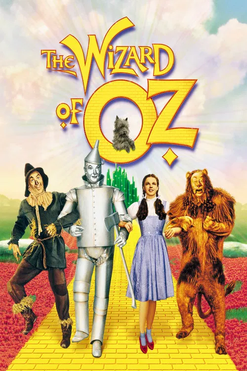
  1. The Wizard of Oz (1939) poster

    The Wizard of Oz

    Victor Fleming · 1939

    Kansas is shot in black and white, tinted sepia. Oz is in rich three-strip Technicolor. The jump from dull to vivid tells you you have entered another world, and the first color you see is a big reveal that works the moment the door opens.

    Where to see it: Dorothy opens the farmhouse door after the tornado. The film switches from sepia to full color as she steps into Munchkinland.
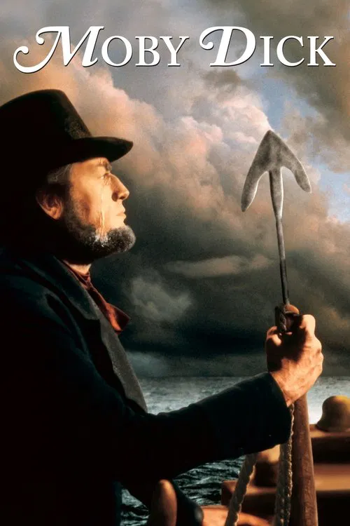
  2. Moby Dick (1956) poster

    Moby Dick

    John Huston · 1956

    Cinematographer Oswald Morris laid a black-and-white print over the color print to get the washed-out look of old whaling illustrations. The result is a muted, almost frozen sea instead of a bright adventure. It makes the voyage feel like a doomed legend from the start.

    Where to see it: The final chase: the muted color carries through the last hunt, from Ahab's boat being smashed to the sinking of the Pequod.

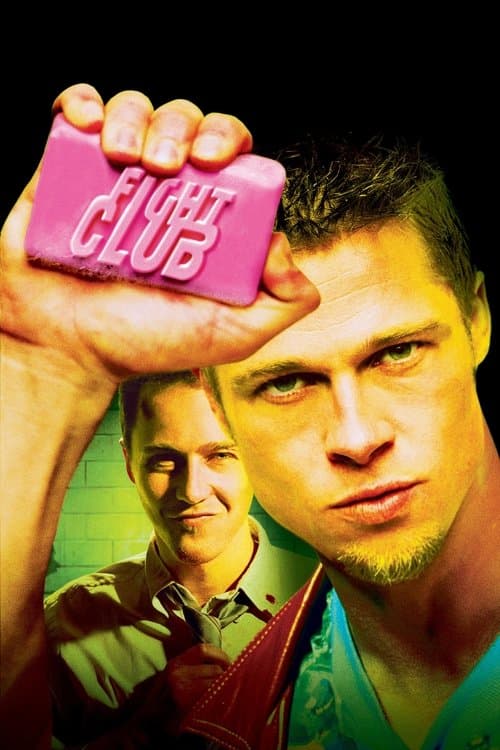
  3. Fight Club (1999) poster

    Fight Club

    David Fincher · 1999

    The Narrator's everyday world is washed-out and green-gray. Whenever Tyler is around, the look gets warmer and has stronger contrast. The colors follow the split in the main character's mind.

    Where to see it: The Narrator's apartment against Paper Street. The look warms up in the scenes with Tyler.

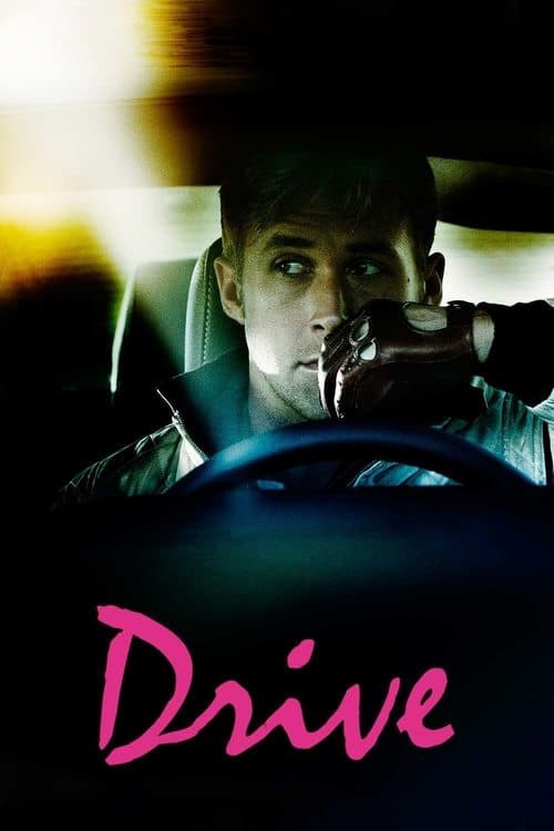
  4. Drive (2011) poster

    Drive

    Nicolas Winding Refn · 2011

    Refn and cinematographer Newton Thomas Sigel color the film in neon pinks and electric blues against deep blacks. These are the colors of a Los Angeles that exists as a romantic fantasy. The color grade is the Driver's state of mind. He sees the world in the heightened, saturated colors of someone who lives inside a movie genre and has no ordinary life outside it.

    Where to see it: The nighttime driving sequences. The neon coloring expresses the Driver's romantic streak. It turns Los Angeles into a place he projects his desires onto.

  5. Enemy (2014) poster

    Enemy

    Denis Villeneuve · 2014

    The film's picture has a yellow tint, so Toronto looks dusty and sick. The grade makes the city feel like a space where something is wrong, in a hushed, strangely oppressive way. You can feel Adam's unease before he says a word.

    Where to see it: The city. Toronto streets and buildings appear in a murky yellow, like air you wouldn't want to breathe.

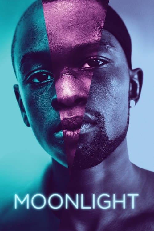
  6. Moonlight (2016) poster

    Moonlight

    Barry Jenkins · 2016

    Each chapter of Chiron's life is bathed in its own set of colors. The cool blues of childhood give way to warmer, harder tones in adulthood. That matches how he hardens emotionally.

    Where to see it: The ocean swimming lesson. The scene is soaked in blue as Juan holds Little afloat.

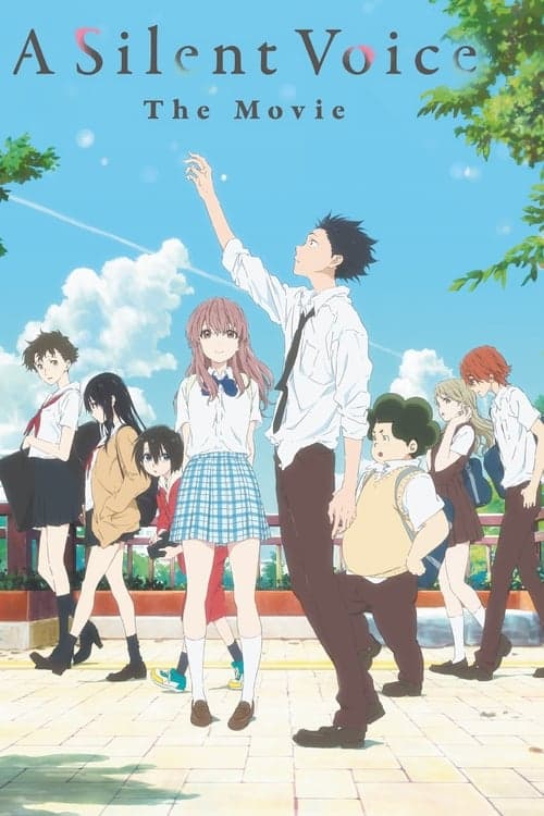
  7. A Silent Voice (2016) poster

    A Silent Voice

    Naoko Yamada · 2016

    Yamada and director of photography Kazuya Takao use warm, rich colors for scenes of real connection. For Shoya's lonely present, they drain the color out. How warm or cold the image looks tells you how things stand between him and the people around him.

    Where to see it: The fireworks sequence. The colors are at their warmest and richest here. The look of the scene tells you a repaired connection is possible, and that it could still easily fall apart.

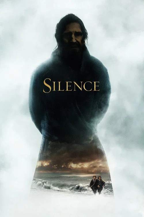
  8. Silence (2016) poster

    Silence

    Martin Scorsese · 2016

    Cinematographer Rodrigo Prieto drew on Baroque painters for the colors. The early part leans blue and cyan, and a golden-yellow hue comes in later. The grade shifts with how the priests' hope and certainty change.

    Where to see it: The film's later stretch in Japan. The warm golden look replaces the cool blue of the early journey.

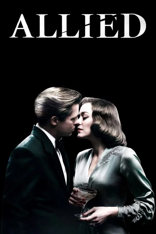
  9. Allied (2016) poster

    Allied

    Robert Zemeckis · 2016

    Cinematographer Don Burgess and Zemeckis split the film into 6 different visual looks to match changing tone and settings. The shifts help you feel when the couple's world is warm, tense or closing in. The look tells you where the story stands before anyone speaks.

    Where to see it: From Casablanca to London: After the assassination in Casablanca, Max and Marianne marry and settle in Hampstead with their daughter Anna.

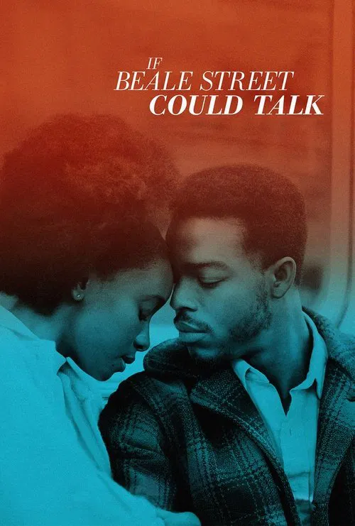
  10. If Beale Street Could Talk (2018) poster

    If Beale Street Could Talk

    Barry Jenkins · 2018

    James Laxton's photography shifts between 2 looks. The memory sequences are warm and soaked in amber, and the present is cooler, harder and more realistic. The difference in color shows you what love used to be and what the system has made of it.

    Where to see it: The flashback sequences of Tish and Fonny falling in love. Memory gets an amber-gold palette. It is set against the cold blue-grey of the prison visiting room.

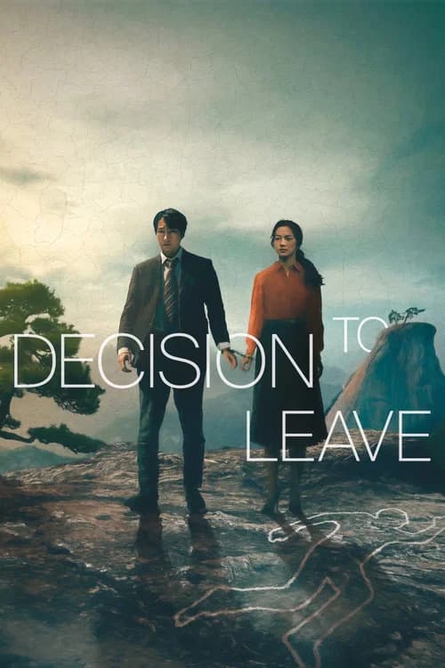
  11. Decision to Leave (2022) poster

    Decision to Leave

    Park Chan-wook · 2022

    Kim Ji-yong shoots with anamorphic lenses for a classic, textural look. Teal and yellow tones divide spaces and mark moods, and teal is tied to Hae-jun's confusion.

    Where to see it: The coastal town sequences where Hae-jun tracks Seo-rae. The sea mist softens every edge. The color grade, the color adjustment done after filming, makes the investigation feel like a dream he can't wake from.

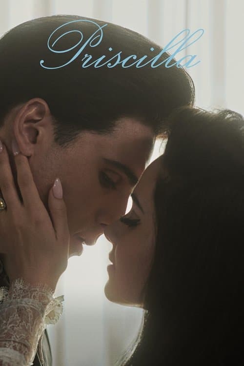
  12. Priscilla (2023) poster

    Priscilla

    Sofia Coppola · 2023

    Philippe Le Sourd's photography gives the German scenes a soft, grey, muted palette that reflects Priscilla's boredom as a teenager. The American side is the colorful one, and the palette grows more saturated through the late 1960s and 1970s. It returns to a more subdued look as the relationship ends. The color tracks how her life and her marriage change.

    Where to see it: The early Germany sequences. They are muted and grey, matching a bored teenager in a drab world. They contrast with the more colorful American scenes at Graceland, where the romance takes on a very different feel.

  13. Spider-Man: Across the Spider-Verse (2023) poster

    Spider-Man: Across the Spider-Verse

    Joaquim Dos Santos, Kemp Powers, Justin K. Thompson · 2023

    Gwen's world, Earth-65, looks like a watercolor painting. The colors in the background shift with how she feels, like a mood ring. You can read her mood from the walls and sky before she says a word.

    Where to see it: Gwen's opening. She plays the drums and talks you through her life, and the watercolor backgrounds melt and change color as her feelings change.

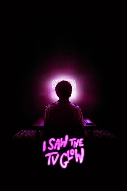
  14. I Saw the TV Glow (2024) poster

    I Saw the TV Glow

    Jane Schoenbrun · 2024

    Schoenbrun and cinematographer Eric Yue color the film in pink, lavender and electric blue. These are the colors of late-night television and fluorescent mall lighting. They stand in for the dissociated state the protagonist lives in, which means feeling detached from yourself and your own life. The colors are nostalgic and deeply wrong at the same time.

    Where to see it: The strip mall scenes under purple-pink artificial light. The color belongs so exactly to 1990s suburbia that you feel something is wrong before you can think it.

Questions

Quick answers

What is color grading as psychology in film?
Adjusting the film's overall color, such as how warm, cold or vivid it looks, to match a character's emotional state. It can also separate different realities or states of mind.
Which films use color grading as psychology?
The Wizard of Oz (1939), Moby Dick (1956), Fight Club (1999), Drive (2011), Enemy (2014), Moonlight (2016) and 8 more films in the CineCode library.
What kind of technique is color grading as psychology?
It is a cinematography technique. Related cinematography techniques include Deliberate Close-Up Performance.