Cinematography technique · used in 22 films

Era-Coded Visual Grammar

Changing the color, film texture and camera style for each time period, and using the fashion and architecture of the day. Every era gets its own distinct feel.

Examples

22 films that use it

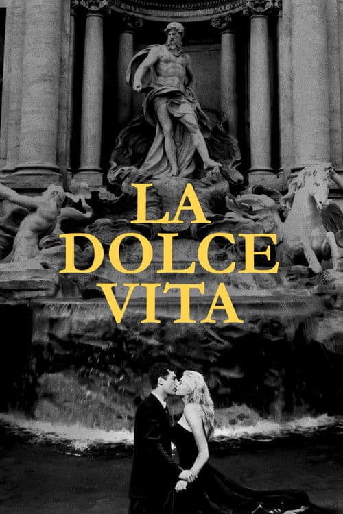
  1. La Dolce Vita (1960) poster

    La Dolce Vita

    Federico Fellini · 1960

    The film is a visual catalog of Rome at the exact moment it was changing after the war: the Vespas, the paparazzi, the nightclubs, the aristocratic villas, the construction cranes. Otello Martelli's photography lets you read 1960 Rome as a specific moment in history. It's a society sitting between its Catholic past and its consumerist future, and it hasn't committed to either yet.

    Where to see it: The Via Veneto sequences. The cafés, the fashion and the celebrities are all there. The film records what Rome looked like while its society was changing, the way a documentary would.
  2. Zelig (1983) poster

    Zelig

    Woody Allen · 1983

    The past is black and white with a damaged, old-film texture. The present-day interviews are in color. You always know which era you are in. The split also tells you the story is being told as history.

    Where to see it: The cut from the 1920s newsreel look to a color interview. The change in color and texture marks the jump from then to now.

  3. Radio Days (1987) poster

    Radio Days

    Woody Allen · 1987

    The 1930s and 1940s are rebuilt with period sets and costumes, from the family home to Radio City Music Hall. The film looks the way Joe remembers it, not the way a documentary would show it. The care tells you he loved it.

    Where to see it: Radio City Music Hall. Joe calls it the most beautiful thing he ever saw, and the film shows it as he remembers it.

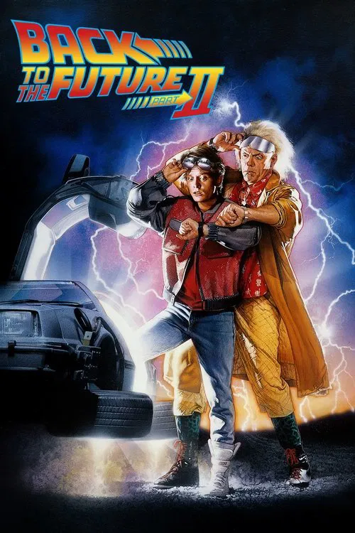
  4. Back to the Future Part II (1989) poster

    Back to the Future Part II

    Robert Zemeckis · 1989

    Each time period gets its own look. The 2015 Hill Valley is bright and futuristic, the altered 1985 is dark and ugly, and 1955 looks like the first film. You always know where you are.

    Where to see it: The time jumps: The film moves between 1985, 2015, the altered 1985 and 1955, with each setting having its own style.

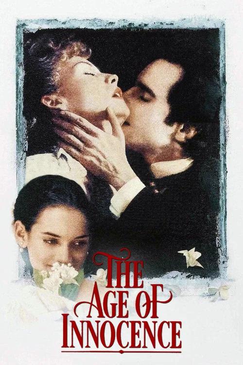
  5. The Age of Innocence (1993) poster

    The Age of Innocence

    Martin Scorsese · 1993

    Gabriella Pescucci won the Academy Award for Best Costume Design. The paintings on the walls were newly made reproductions. In this world a dinner or a dress tells you who is accepted.

    Where to see it: Ellen's dinner: Archer gets the van der Luydens to host a dinner that restores Ellen's standing.

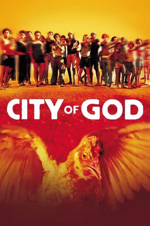
  6. City of God (2002) poster

    City of God

    Fernando Meirelles · 2002

    Charlone and Meirelles give each decade its own look. The 1960s have a warm, yellow-tinged texture. The 1970s are more naturalistic. The 1980s are hard, washed-out and fast. The camera style shows history as a decline, with the world getting more dangerous as it gets more modern.

    Where to see it: The transition from the 1960s Tender Trio sequences to the 1970s Li'l Zé sequences. The look gets harder.

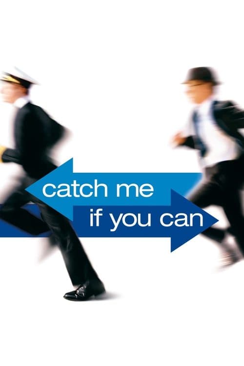
  7. Catch Me If You Can (2002) poster

    Catch Me If You Can

    Steven Spielberg · 2002

    Janusz Kamiński shoots in the warm, rich colors of 1960s American cinema, with the Pan Am blues, the hospital whites and the FBI office greys. Each location gets the color that fits the myth of its period. The look carries the optimism of the era, which Frank is exploiting and living out at the same time.

    Where to see it: The Pan Am sequences. You get the blue uniforms, the clean lines of the airport and the 'Sixties' look of flying as glamour. The myth of the era is photographed with the love of someone who knows it was already half fiction.

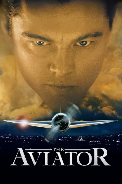
  8. The Aviator (2004) poster

    The Aviator

    Martin Scorsese · 2004

    For roughly the first 52 minutes, the colors lean red and cyan, in imitation of early two-color film processes. After 1935, the grade changes to the rich look of three-strip Technicolor. Robert Richardson shot it. You feel time passing through the picture itself.

    Where to see it: The early Hell's Angels scenes. Greens turn blue and the image has the thin, hand-tinted feel of the earliest color movies.

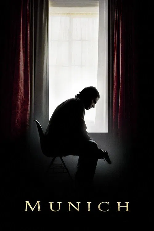
  9. Munich (2005) poster

    Munich

    Steven Spielberg · 2005

    The film looks like a 1970s thriller, with grainy light and slow zooms. The cities, cars and clothes all fit the early 1970s. That look keeps the story grounded in a real time and not in a modern action movie.

    Where to see it: The Rome assassination: The team's first target is shot in the lobby of his building in a plain, tense scene.

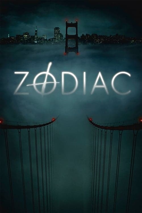
  10. Zodiac (2007) poster

    Zodiac

    David Fincher · 2007

    Fincher and cinematographer Harris Savides show San Francisco in the late 1960s and 1970s with a mundane, slightly muted look. Their references were the photographs of William Eggleston and Stephen Shore and real police photos. Because of that, the period feels lived in.

    Where to see it: The late-1960s opening sequences. The image looks like photographs taken in that era. You read the period in the quality of the light as well as in the period details.

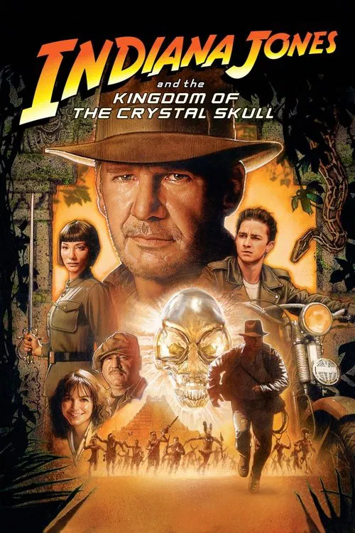
  11. Indiana Jones and the Kingdom of the Crystal Skull (2008) poster

    Indiana Jones and the Kingdom of the Crystal Skull

    Steven Spielberg · 2008

    The film swaps the old adventure-serial look for 1950s imagery. It has suburban test towns, rock and roll, atomic fears and flying saucers. The costumes, music and sets shift to match the Cold War era.

    Where to see it: The nuclear test town: Indy escapes a fake suburban town filled with mannequins just before an atomic test.

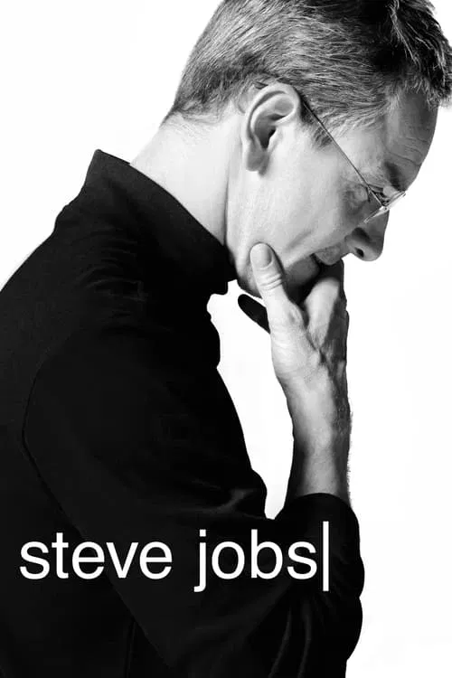
  12. Steve Jobs (2015) poster

    Steve Jobs

    Danny Boyle · 2015

    Boyle and cinematographer Alwin Küchler shot 1984 on 16 mm film, 1988 on 35 mm and 1998 digitally. Each format has its own texture, so the picture tells you what decade you are in. You feel Jobs's world getting cleaner and more digital as the years pass.

    Where to see it: The 3 launches. 1984 at the Flint Center, 1988 at the War Memorial Opera House and 1998 at Davies Symphony Hall each get their own look.

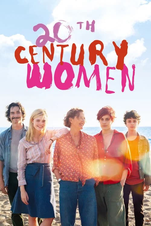
  13. 20th Century Women (2016) poster

    20th Century Women

    Mike Mills · 2016

    Sean Porter's photography uses the warm grain and muted colors of late-1970s photography. The punk venues are shot with the grainy texture of a concert photo. The scenes at home have the amber of a real household photograph from the period.

    Where to see it: The punk concert sequence. The photography copies the specific look of 1979 concert photography. With that grain and contrast, the era feels like something you lived through and less like a recreation.

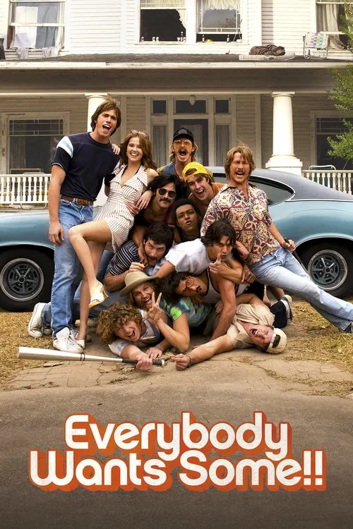
  14. Everybody Wants Some!! (2016) poster

    Everybody Wants Some!!

    Richard Linklater · 2016

    The film is set in fall 1980, and the costumes, haircuts and music place you there in every shot. You can tell when you are in the disco, the country bar or the punk club by what everyone is wearing and doing.

    Where to see it: The night out: The team starts at a local disco, where Jay's arrogant remarks provoke a brawl, then changes clothes and heads to a western-themed bar.

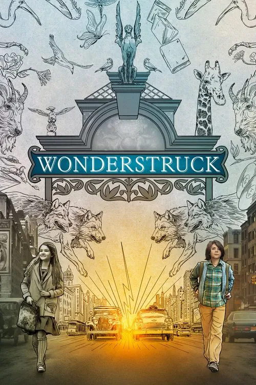
  15. Wonderstruck (2017) poster

    Wonderstruck

    Todd Haynes · 2017

    The 1927 scenes are shot in black and white with a design Haynes called not naturalistic or literal. The 1977 scenes are in color with the gritty urban look of films like Midnight Cowboy and The French Connection. You always know which era you are in.

    Where to see it: The 1927 scenes. Rose's story is in black and white, with a design influenced by silent films by Murnau and King Vidor.

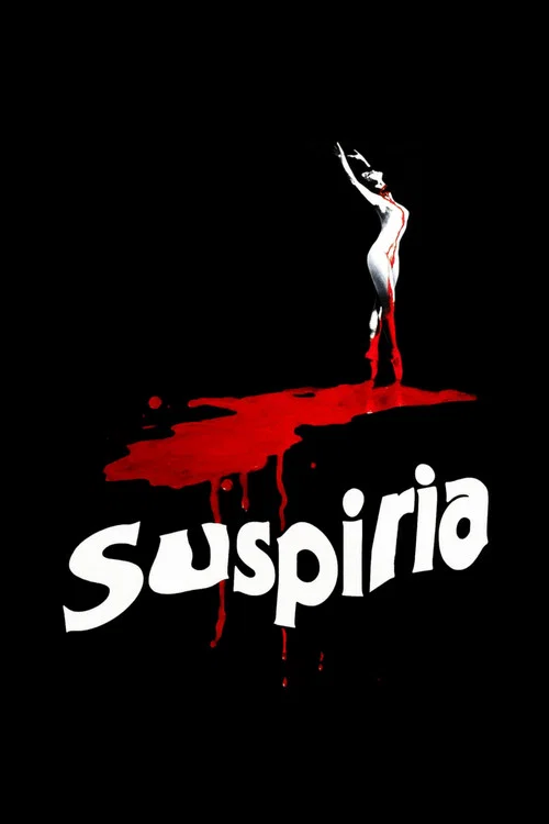
  16. Suspiria (2018) poster

    Suspiria

    Luca Guadagnino · 2018

    Cinematographer Sayombhu Mukdeeprom used long zooms, which were fashionable in the 1970s, and visible grain to bring back the look of films from that decade. The colors are sparing and the mood is wintry and dark. You feel the decade in the camera.

    Where to see it: The Volk performance. In the film's six-minute climactic dance sequence, Susie leads the academy's piece while Sara dances in a trance and then collapses in pain.

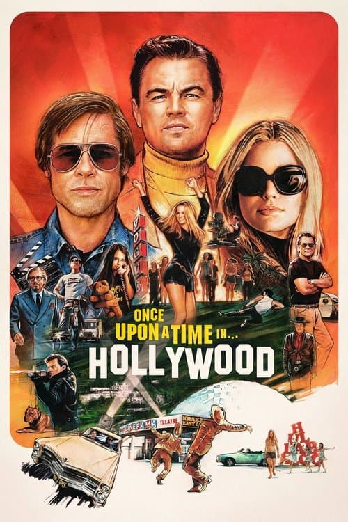
  17. Once Upon a Time in Hollywood (2019) poster

    Once Upon a Time in Hollywood

    Quentin Tarantino · 2019

    Robert Richardson shoots 1969 Hollywood on Kodak 35 mm film with old anamorphic lenses, chasing the vibrant look of Technicolor. The entire film feels like the last photograph taken before an ending.

    Where to see it: The Spahn Ranch sequence. The ranch's sun-bleached colors set it apart from Hollywood's gold, as a place where the rules are different.

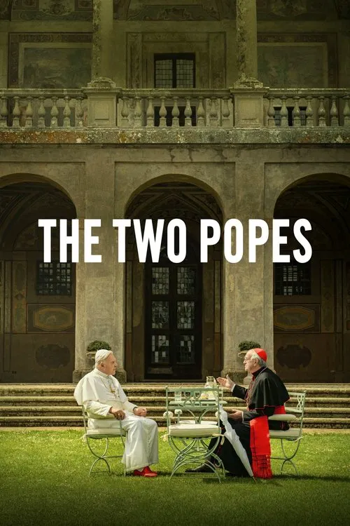
  18. The Two Popes (2019) poster

    The Two Popes

    Fernando Meirelles · 2019

    The flashbacks to Bergoglio's youth in Argentina look different from the scenes in Rome. Rome is shot in grand rooms, with a full-scale Sistine Chapel built at Cinecittà. The Buenos Aires of the past looks like a different world. The change in look tells you the time and place before anyone speaks.

    Where to see it: The Argentina flashbacks. Young Bergoglio, played by Juan Minujin, is shown in his Jesuit training and in the years of the dictatorship.

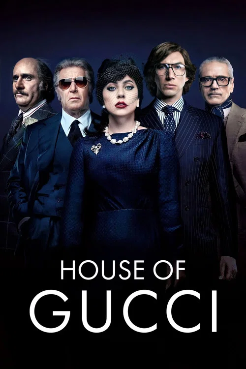
  19. House of Gucci (2021) poster

    House of Gucci

    Ridley Scott · 2021

    The story moves through several decades, and fashion marks the time. The production had access to the Gucci archives for wardrobe and props. Clothes and interiors tell you where you are in time and how much the family's taste is changing.

    Where to see it: The decades: The film follows Patrizia and Maurizio from the late 1970s into the 1990s, with new clothes and settings at each stage.

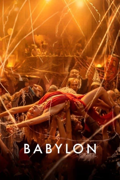
  20. Babylon (2022) poster

    Babylon

    Damien Chazelle · 2022

    Sandgren shot the film on 35mm and push-processed the negative for more grain, color and contrast. The look follows Hollywood's move from silent pictures to talkies.

    Where to see it: The transition from the silent film sequences to the talkie sequences. The look of the film changes to mark the new technology, which is the break that destroys Jack Conrad's career.

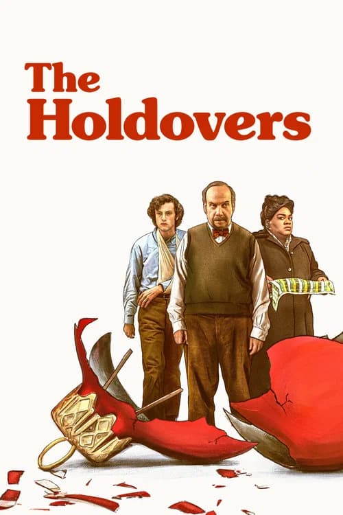
  21. The Holdovers (2023) poster

    The Holdovers

    Alexander Payne · 2023

    Eigil Bryld shot digitally on an Arri Alexa with Panavision lenses, and film emulation and color grading were added in post-production. The goal was a look that recalls films from 1970. The film ends up feeling like an object discovered from its own period.

    Where to see it: The film's opening titles and visual texture. The retro title cards and the color are so accurate to the period that the 1970 setting feels like something found.

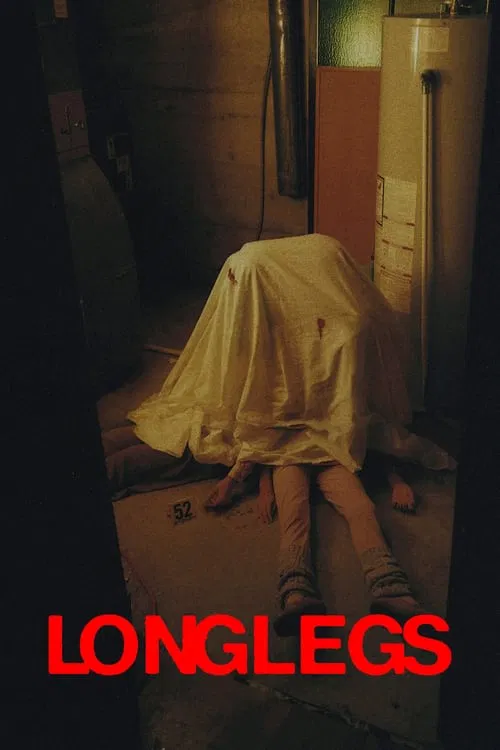
  22. Longlegs (2024) poster

    Longlegs

    Osgood Perkins · 2024

    The 1970s scenes were shot on 35mm film in a boxy 4:3 frame. The 1990s scenes were shot digitally in a wide 2.39:1 frame. Some flashbacks even have rounded corners, like an old photo. You always know which time you are in, and the past looks like a snapshot.

    Where to see it: The opening in 1974. A little girl with a Polaroid camera walks out into the snow to meet a strange man, all inside the square, old-looking frame.

Questions

Quick answers

What is era-coded visual grammar in film?
Changing the color, film texture and camera style for each time period, and using the fashion and architecture of the day. Every era gets its own distinct feel.
Which films use era-coded visual grammar?
La Dolce Vita (1960), Zelig (1983), Radio Days (1987), Back to the Future Part II (1989), The Age of Innocence (1993), City of God (2002) and 16 more films in the CineCode library.
What kind of technique is era-coded visual grammar?
It is a cinematography technique. Related cinematography techniques include Practical In-Camera Effects.