Cinematography technique · used in 14 films

Period Color Separation

Giving each time period or social world in the film its own set of colors. You always know where and when you are, and the colors carry a mood too.

Examples

14 films that use it

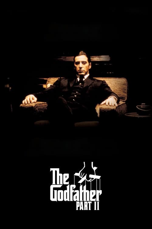
  1. The Godfather Part II (1974) poster

    The Godfather Part II

    Francis Ford Coppola · 1974

    Gordon Willis shoots the 1910s sequences in warm sepia tones that recall old photographs and nostalgic myth. He shoots Michael's present-day world in cold, washed-out blue-greens. The past ends up looking like a dream and the present feels like a trap.

    Where to see it: Young Vito's Corleone street scenes against Michael's Lake Tahoe estate. The street scenes are warm and the estate is ice-blue.
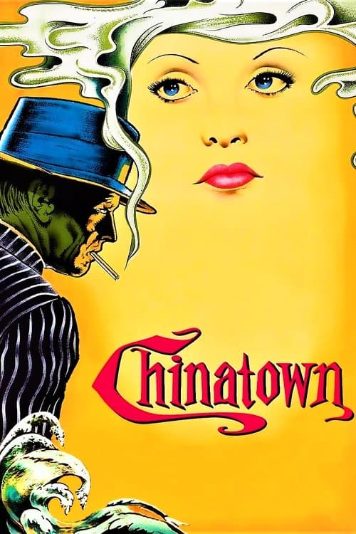
  2. Chinatown (1974) poster

    Chinatown

    Roman Polanski · 1974

    The amber and ochre tones present 1930s Los Angeles as a real historical setting. They also make it a classic picture of corruption, heat and moral decay.

    Where to see it: The reservoir scenes. They are shot in dusty golden light, which makes the city's man-made supply of water feel like a mirage.

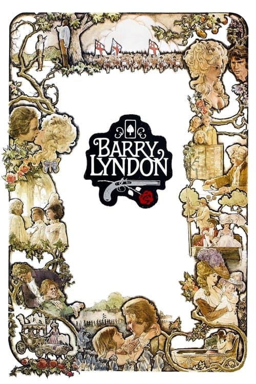
  3. Barry Lyndon (1975) poster

    Barry Lyndon

    Stanley Kubrick · 1975

    Kubrick used Zeiss lenses originally developed for NASA to shoot by real candlelight. The interiors he got look like 18th-century oil paintings in the warmth of their color and the quality of their shadows. The film is lit the way the period would have been, so every interior feels like a Hogarth or a Gainsborough.

    Where to see it: The candlelit interior scenes. The warm, orange-amber light was achieved with candles, so many interiors are photographed in the actual light of its era.

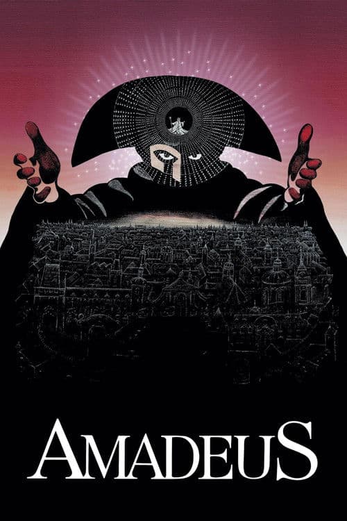
  4. Amadeus (1984) poster

    Amadeus

    Miloš Forman · 1984

    Vienna's imperial world is shown in golds, crimsons and warm candlelight, and everything looks rich. The asylum scenes that frame the story are cold and gray, with the color drained out. The contrast lets you follow the film's structure by color alone. The past is warm and full of music and obsession. The present is cold, with only madness and confession.

    Where to see it: The cut from the asylum's gray corridors to the first flashback in Vienna's gilded concert halls. The color shift tells you which world you've entered.

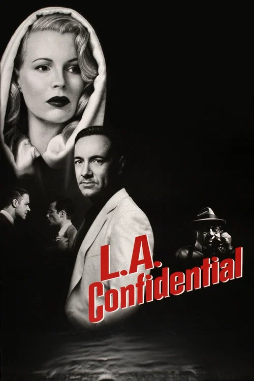
  5. L.A. Confidential (1997) poster

    L.A. Confidential

    Curtis Hanson · 1997

    The amber and gold palette places 1953 Los Angeles between the 1940s noir it references and the corruption it will become. That is, the color makes the decade feel like a beautiful lie that has already started to yellow.

    Where to see it: The opening montage of Los Angeles's postwar boom. It is all rich color and promise, and the rest of the film darkens it step by step.

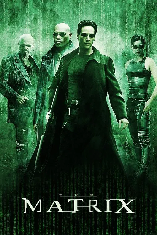
  6. The Matrix (1999) poster

    The Matrix

    Lana Wachowski, Lilly Wachowski · 1999

    Cinematographer Bill Pope and the Wachowskis gave the Matrix sequences a green tint, the color of phosphor monitors. The real world (the Nebuchadnezzar) is shot in cool blue-grey. The shift in color is subtle but consistent, and it works on you without you noticing.

    Where to see it: Neo's first re-entry into the simulation. The Nebuchadnezzar's blue-grey gives way to the Matrix's green tint.

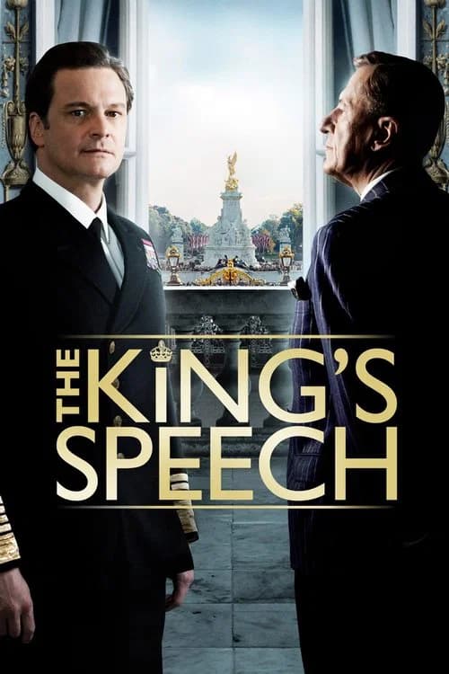
  7. The King's Speech (2010) poster

    The King's Speech

    Tom Hooper · 2010

    Danny Cohen's photography uses amber, grey and muted green. It makes 1930s Britain look like a world of worn-out imperial grandeur. It is beautiful, but heavy with the weight of tradition.

    Where to see it: The Westminster Abbey coronation scenes. They are shot in a deep amber-gold that feels historically authentic and suffocating with duty at once.

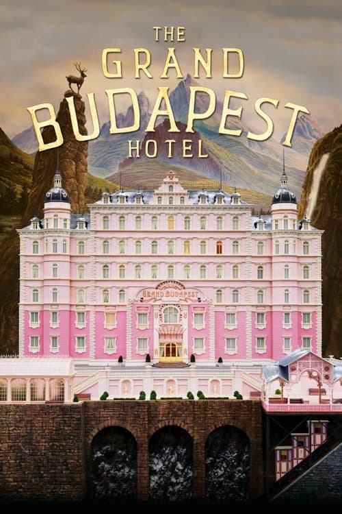
  8. The Grand Budapest Hotel (2014) poster

    The Grand Budapest Hotel

    Wes Anderson · 2014

    Anderson shoots each era in a different aspect ratio, which is the shape of the frame. The 1980s and present-day frame is 1.85:1, the 1960s are in 2.40:1 widescreen and the 1930s story is in 1.37:1 Academy. Each ratio matches the main cinema format of its era. Alongside that, the color shifts. The 1930s sections are the most saturated and the present is the most muted.

    Where to see it: The transitions between narrative frames. The shape of the picture changes as the film moves between time periods, and each era announces itself with its own look.

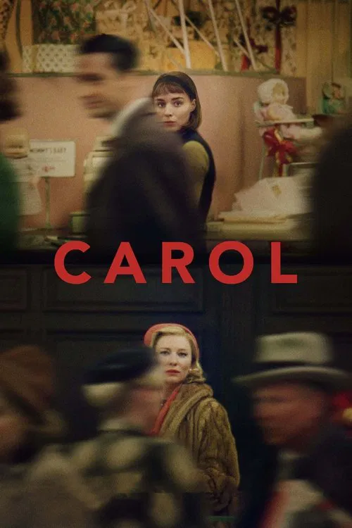
  9. Carol (2015) poster

    Carol

    Todd Haynes · 2015

    Lachman shot on Super 16mm film to get the grainy, warm and faded quality of early 1950s color photography. Every frame looks like a found photograph. The period look comes across as beautiful and short-lived.

    Where to see it: The motel room scenes in Waterloo, Iowa. The amber grain of the Super 16 makes the intimacy feel fragile, as if the image itself might not survive.

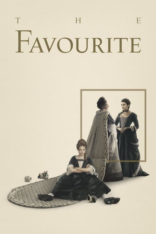
  10. The Favourite (2018) poster

    The Favourite

    Yorgos Lanthimos · 2018

    Ryan shoots in natural light and candlelight wherever he can, so the interiors look like paintings from Queen Anne's time. The whites are cream, the shadows are warm brown and the outdoor scenes show gray-green English countryside. The colors make a case. This world was as real as ours, and its power struggles were as real as its colors.

    Where to see it: The palace interior sequences. The candlelit rooms sit in warm amber and deep shadow. The period color makes this historical world feel lived in.

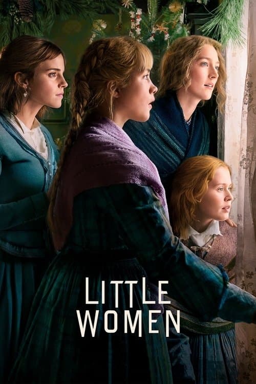
  11. Little Women (2019) poster

    Little Women

    Greta Gerwig · 2019

    Yorick Le Saux's photography uses amber firelight and rich, warm color for the childhood scenes. The adult present gets cold light and washed-out grey. The past feels the way memory feels, even though the present is the more honest of the 2.

    Where to see it: The shift from the golden Christmas party in the past to Jo alone in her cold New York room in the present. The cut takes 2 seconds, and it holds what the film wants you to feel about memory and loss.

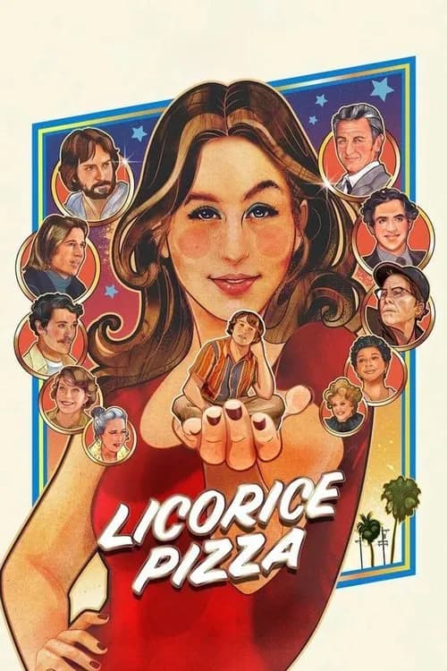
  12. Licorice Pizza (2021) poster

    Licorice Pizza

    Paul Thomas Anderson · 2021

    Michael Bauman and PTA shoot the Valley in the warm, slightly faded colors of 1970s photography. The golden light of the San Fernando Valley summer makes the period feel lived-in.

    Where to see it: The Valley's residential streets at golden hour. The light and color match the era so closely that the film pretty much looks like a photograph from 1973 that learned to move.

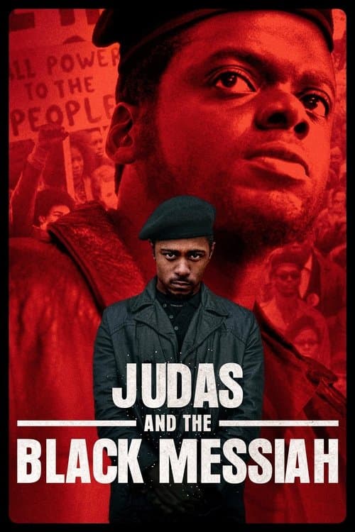
  13. Judas and the Black Messiah (2021) poster

    Judas and the Black Messiah

    Shaka King · 2021

    Sean Bobbitt's photography uses a warm, dark "Panther green" for the Panthers' clothing and key locations. The FBI gets silhouettes, brown earth tones and a touch of coldness. The color tells you where the film's sympathies lie.

    Where to see it: The Panthers' headquarters against the FBI's offices. The Panther spaces carry the warm green. The FBI spaces are shot in brown earth tones with sharp contrast, which makes the surveillance machine feel bloodless.

  14. A Complete Unknown (2024) poster

    A Complete Unknown

    James Mangold · 2024

    Phedon Papamichael's cinematography uses film grain, warm tungsten light and washed-out winter colors for the early 1960s Greenwich Village scenes. It puts you in a world of folk music coffeehouses and cold-water apartments. The look is there to make the era feel authentic.

    Where to see it: The early Greenwich Village scenes. The colors look like photographs of the folk scene taken at the time, and the film doesn't give the past a nostalgic movie glow.

Questions

Quick answers

What is period color separation in film?
Giving each time period or social world in the film its own set of colors. You always know where and when you are, and the colors carry a mood too.
Which films use period color separation?
The Godfather Part II (1974), Chinatown (1974), Barry Lyndon (1975), Amadeus (1984), L.A. Confidential (1997), The Matrix (1999) and 8 more films in the CineCode library.
What kind of technique is period color separation?
It is a cinematography technique. Related cinematography techniques include Chiaroscuro Lighting, One-Point Perspective.